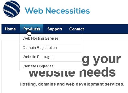
So what is usability and how does it relate to your menu? In this interview Reece Lamshed asks John Parnell Pierce about good menu design and usability.
Note: This interview is 6 years old. It was part of a training resource for beginner interactive media students. Though web technology has changed, the principles discussed are still relevant.
Transcript
REECE: What some of the principles of good design that you would see on a website?
JOHN: I suppose one of the areas we’re moving into when you talk about these things is the area of usability, and it’s about how the user interfaces with the page and how to use the interface itself, the layout of the page, how the user find the links that they want and how do you find information. Where their eyes go when they first visit the site.
It is important that you have menu structures that reflects your core areas of interest, that reflects what your users are going to be looking for and effectively guides them to the place where they want to go. If you are doing your website, say for a pet shop, you could have a menu that says cats, dogs, fish, snakes, lizards. But maybe you actually need to get a single button that says pets and you roll over that and you get to pull down menu that lists those animals. What you are actually doing there is chunking your menu items under a single category which can then be accessed by the user of it. You give that category a name which is going to reflect what the contents is, so user sees the category, goes “yes, I am looking for a pet”, and if I select pets, I get a list of pets and it will take us to the right page. By chunking the information on the menus it allows you then to have a fairly simple menu structure on your home page, which then guides the user through to the part of the site that is relevant to them. One of the things you need to be focused on is what the user experience of the website’s going to be. We don’t want to user to get frustrated, you don’t want to user to go to the home page and not find what they are looking for, and effectively if a user has not found what they are after, after about 3 clicks then they’re going to go away. People aren’t that tolerant, they’ll go back to Google and do another search.
REECE: With the menu, that means that having a menu consistency, i guess, across every page in affect, like having a menu bar.
JOHN: I think either having eitther a menu at top of the page and one down the side of the page is the most effective way to put that information. I think the menu should remain consistent from page to page, because what happens when you go to the first page of the site is you learn the menu structure for that site. You go there and you see that the menu is across the top. You might notice that the menu item for the page that you are on is a different colors to the other buttons. If you go to another page and it looks completely different, you’re going to confuse the user. So consistency of design across the site, and this is some websites fall flat, especially websites that are being changed over time, one section will have one navigation one design style, when you go to few pages deeper in and you will find a completely different design. The user has relearn the interface, potentially gets frustrated and goes away.

